Balance
- Field
- Branding
- Year
- 2026
- Branding Course / Third Year
Balance is a nutritional supplements brand designed for young women, supporting them throughout the hormonal changes of the monthly cycle.
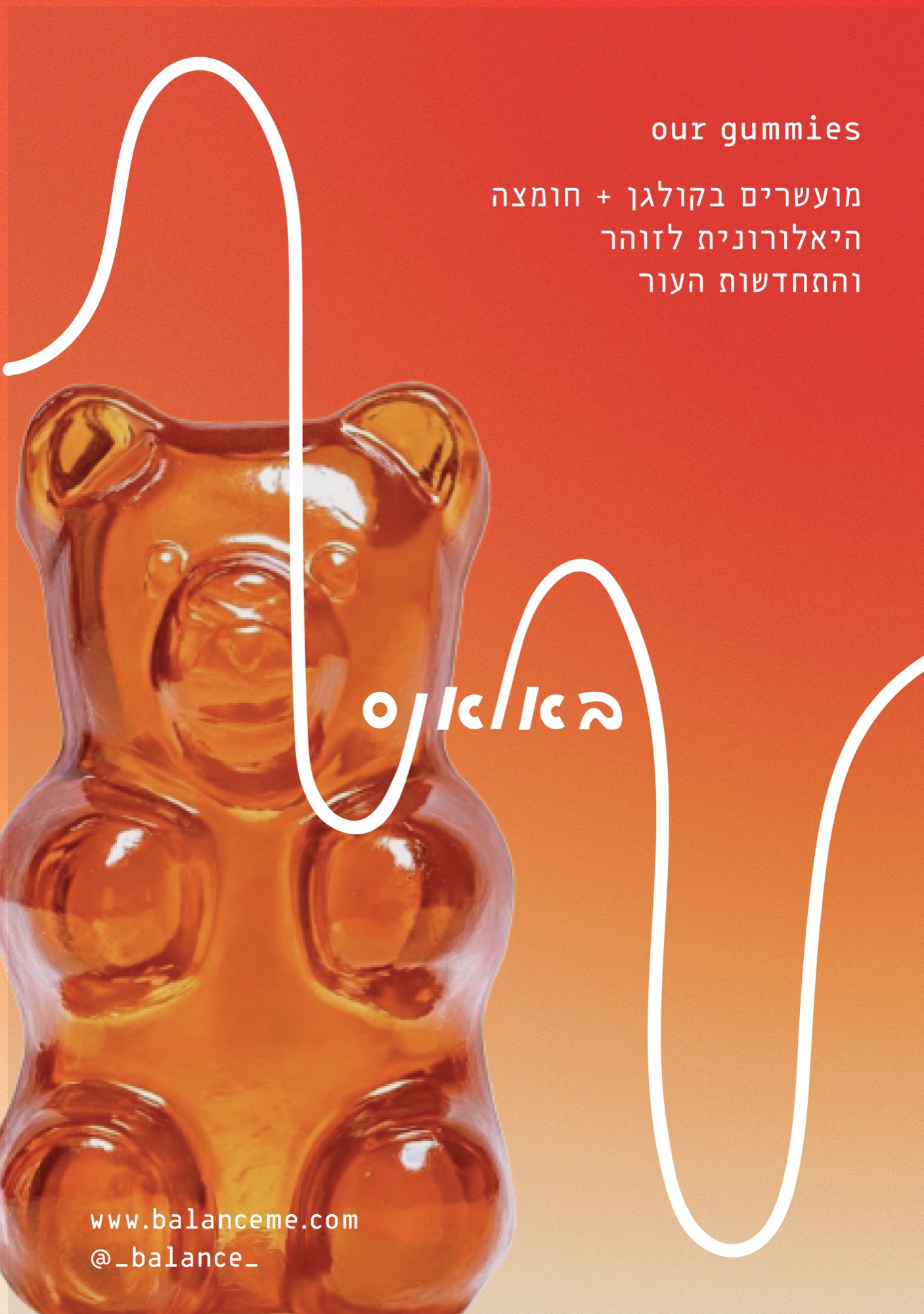
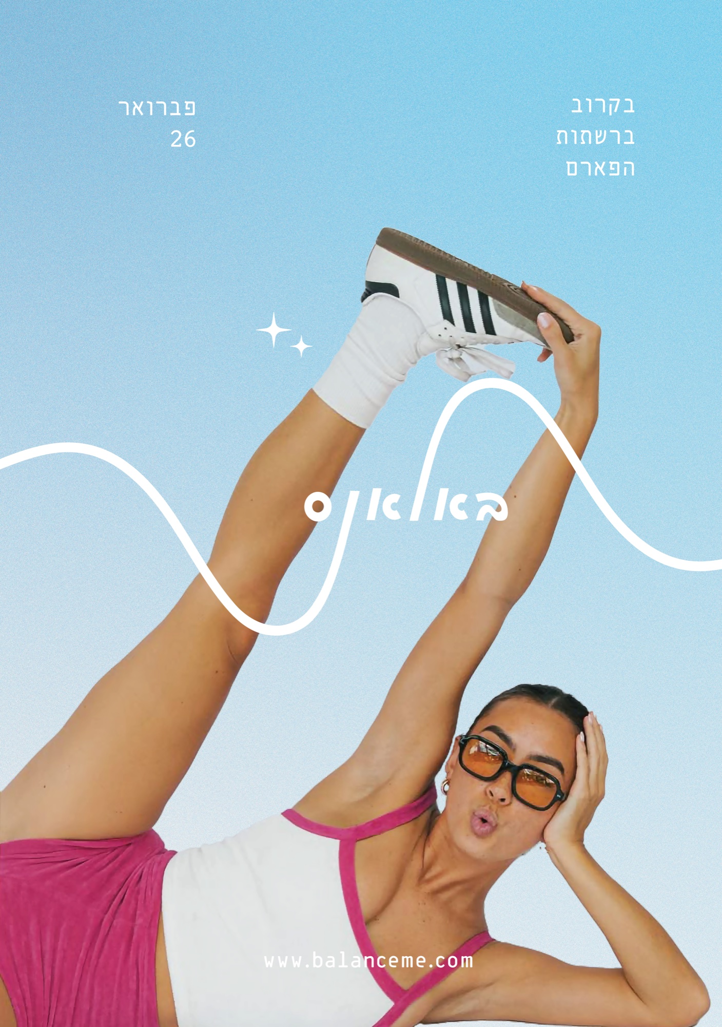
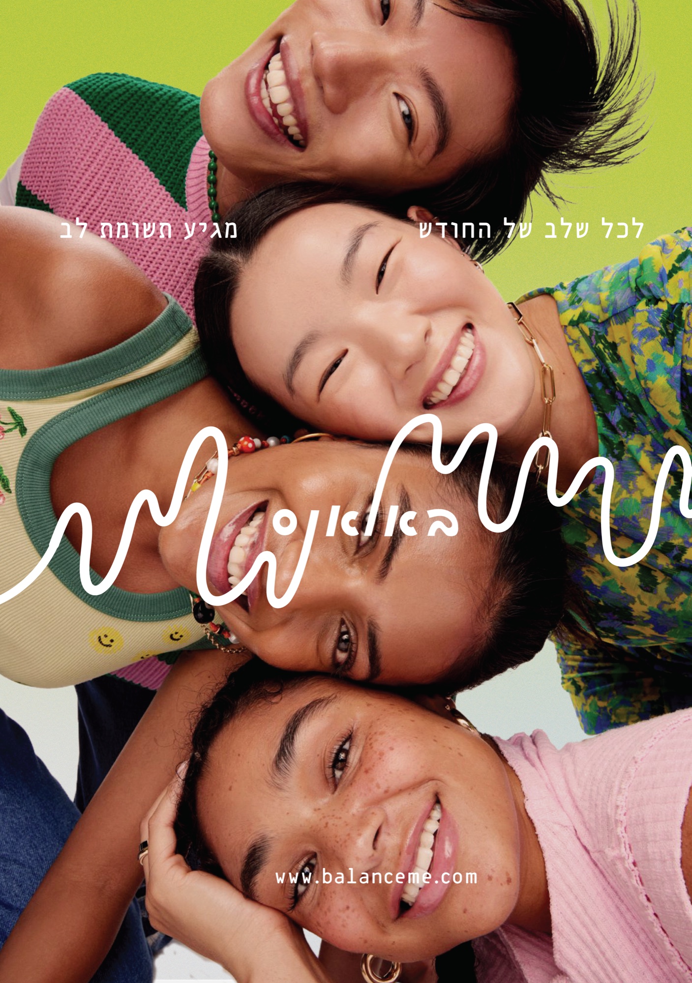
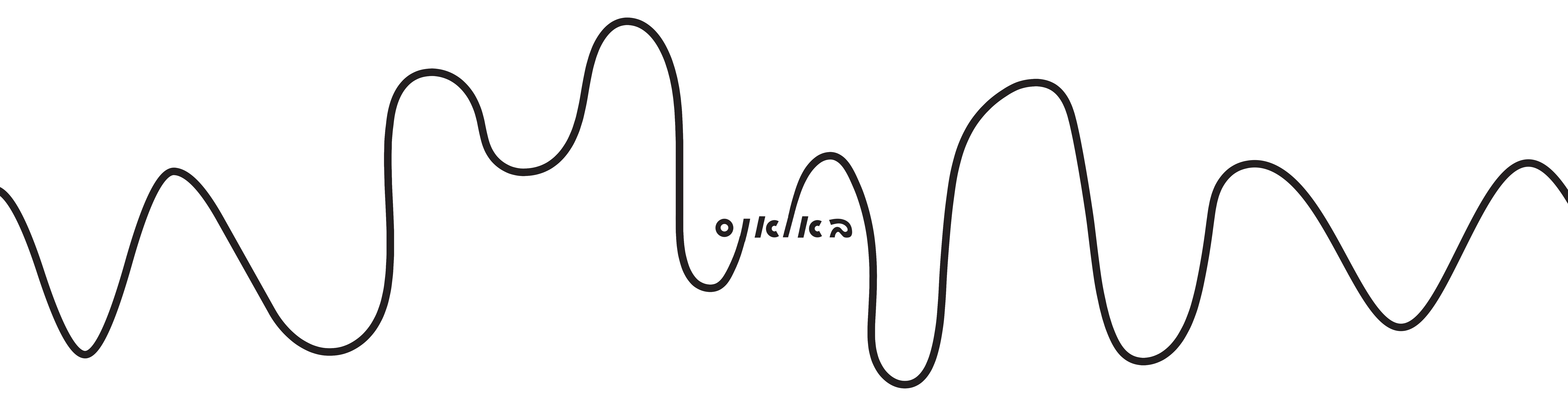
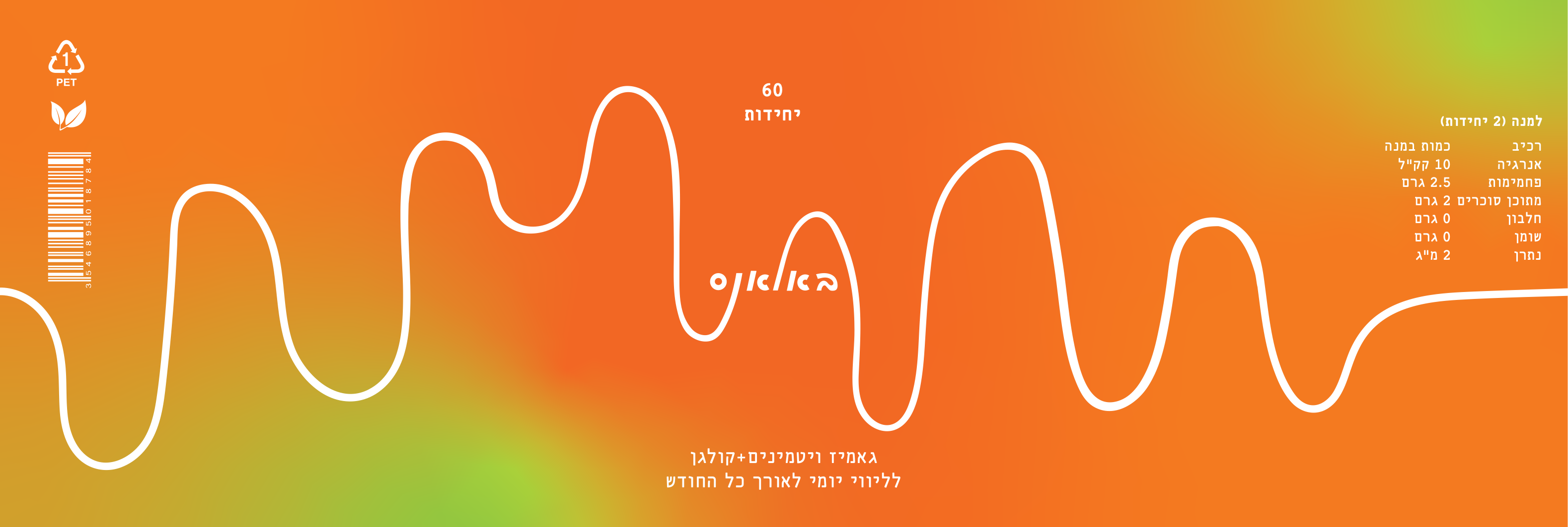
The logotype was inspired by the natural fluctuations experienced during the month, reflecting movement, rhythm, and balance. The brand aims to make this experience feel lighter, more approachable, and positive.
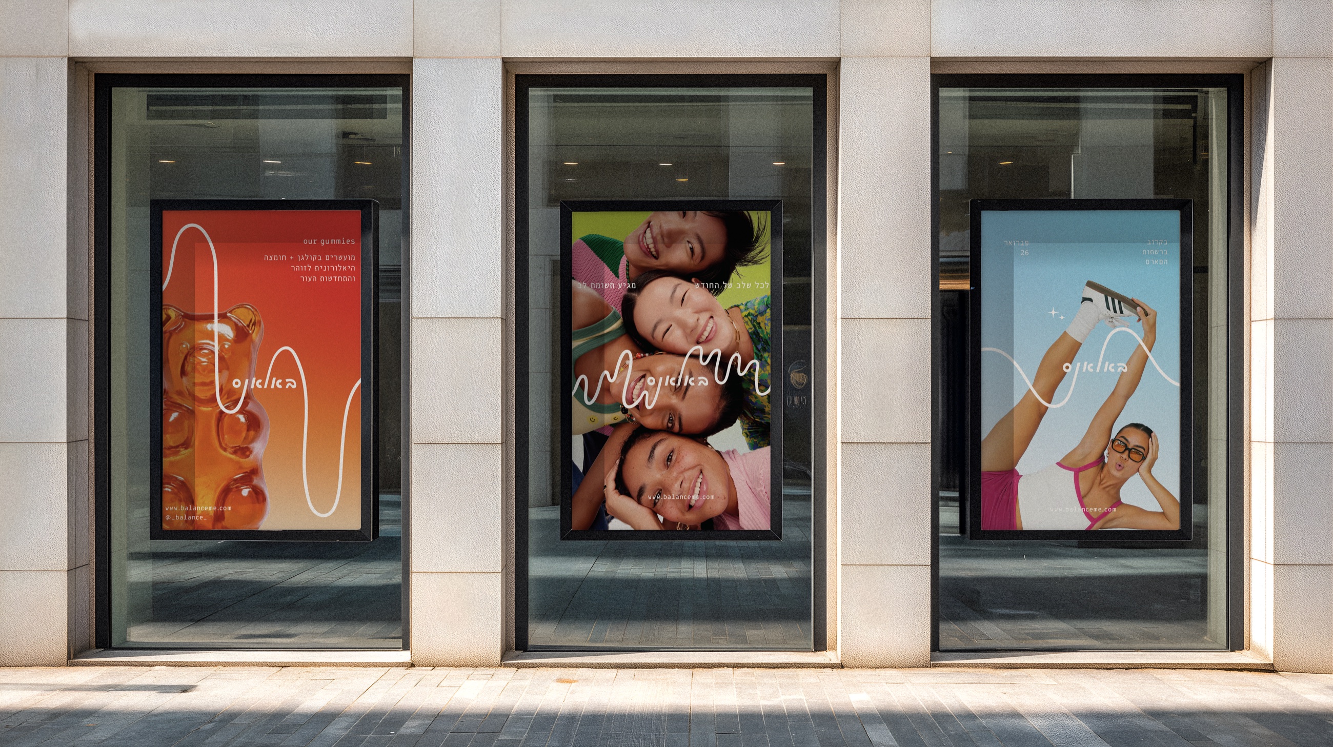
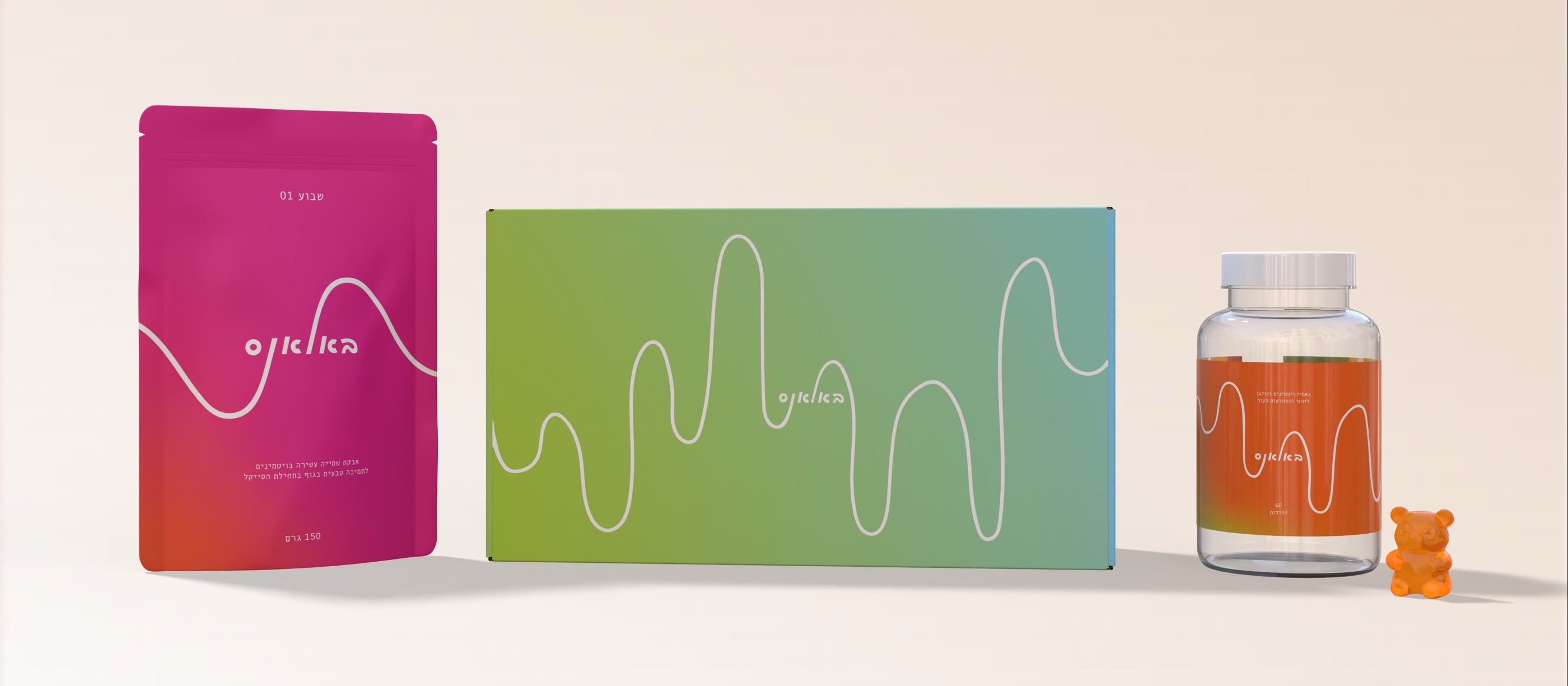
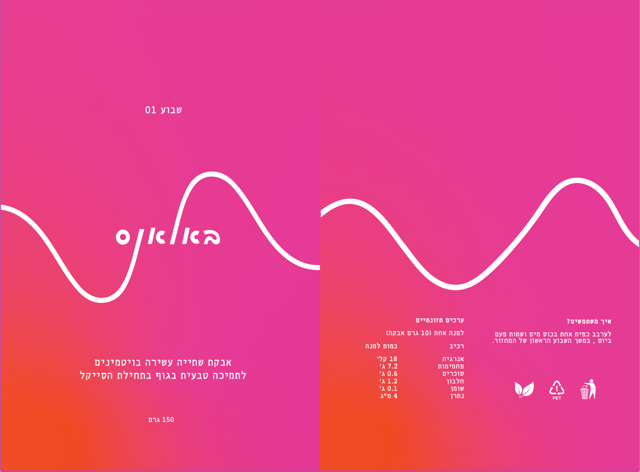
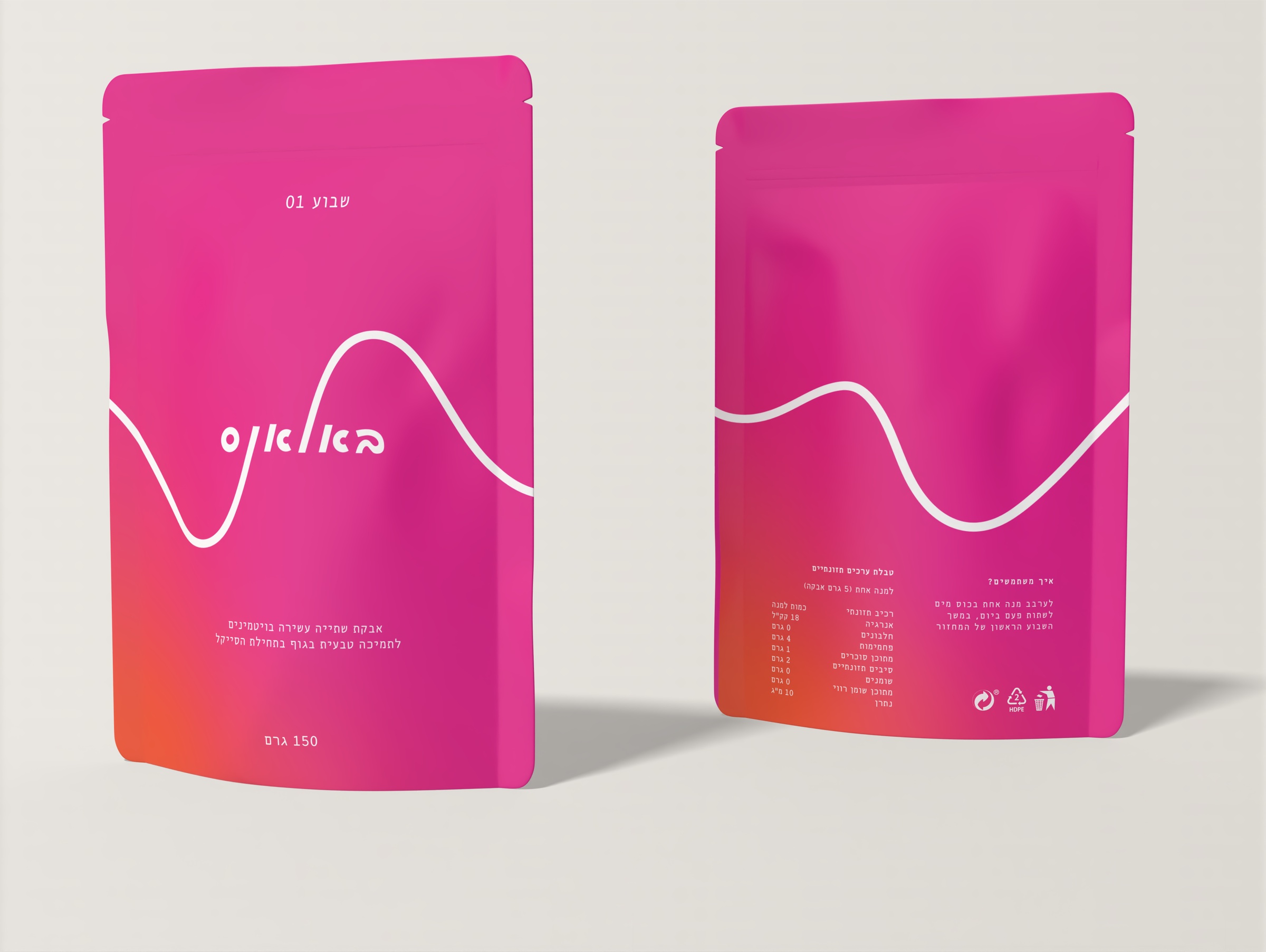
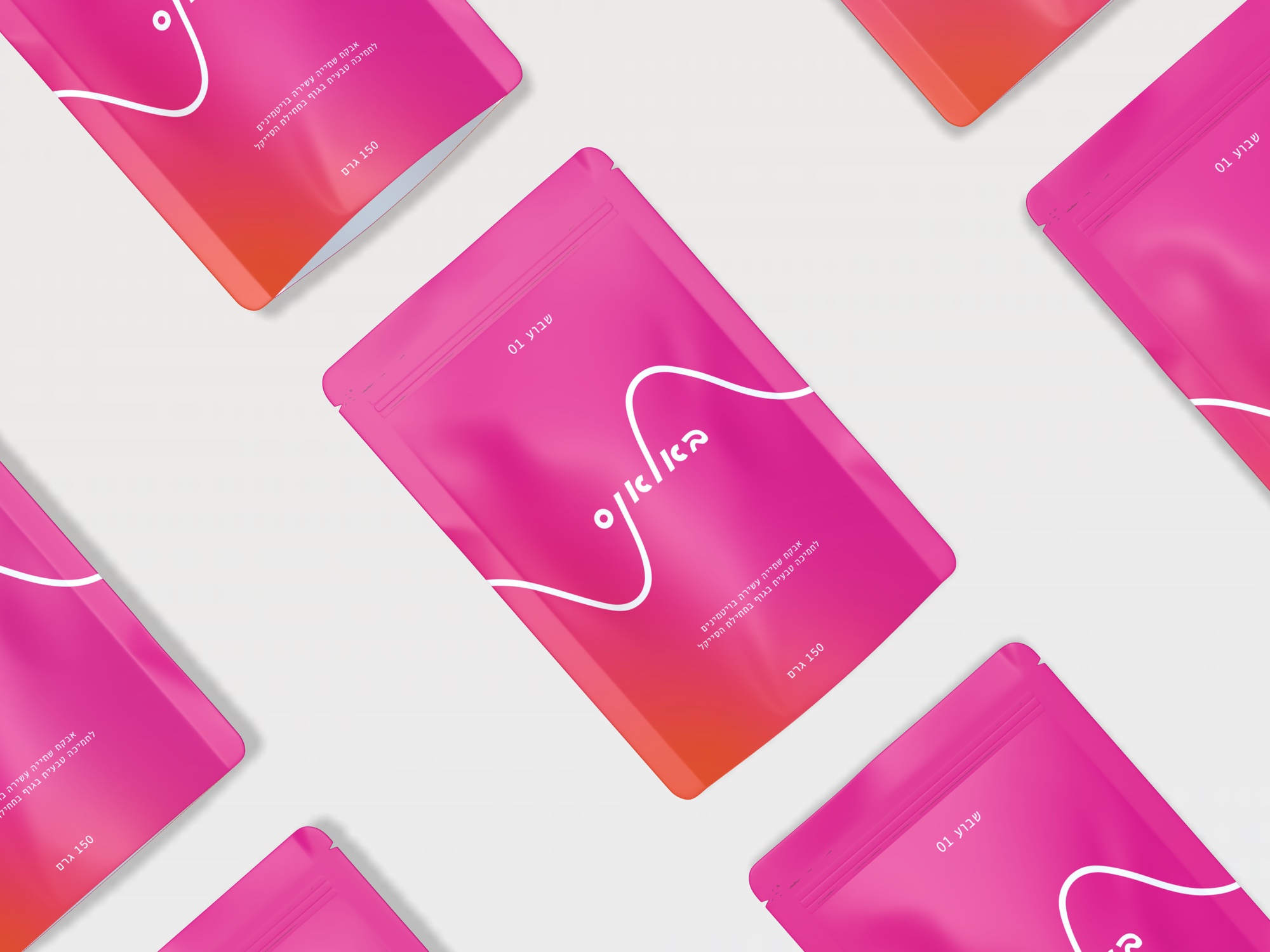
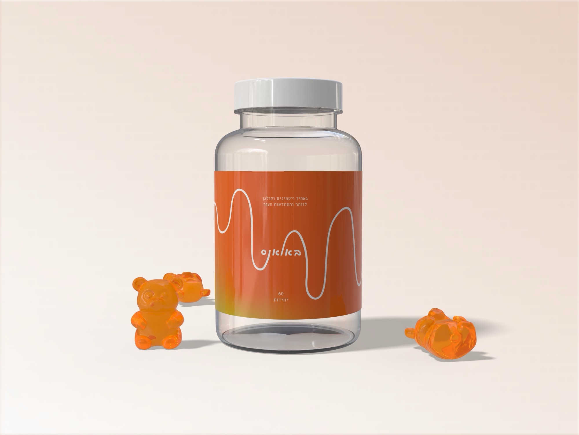
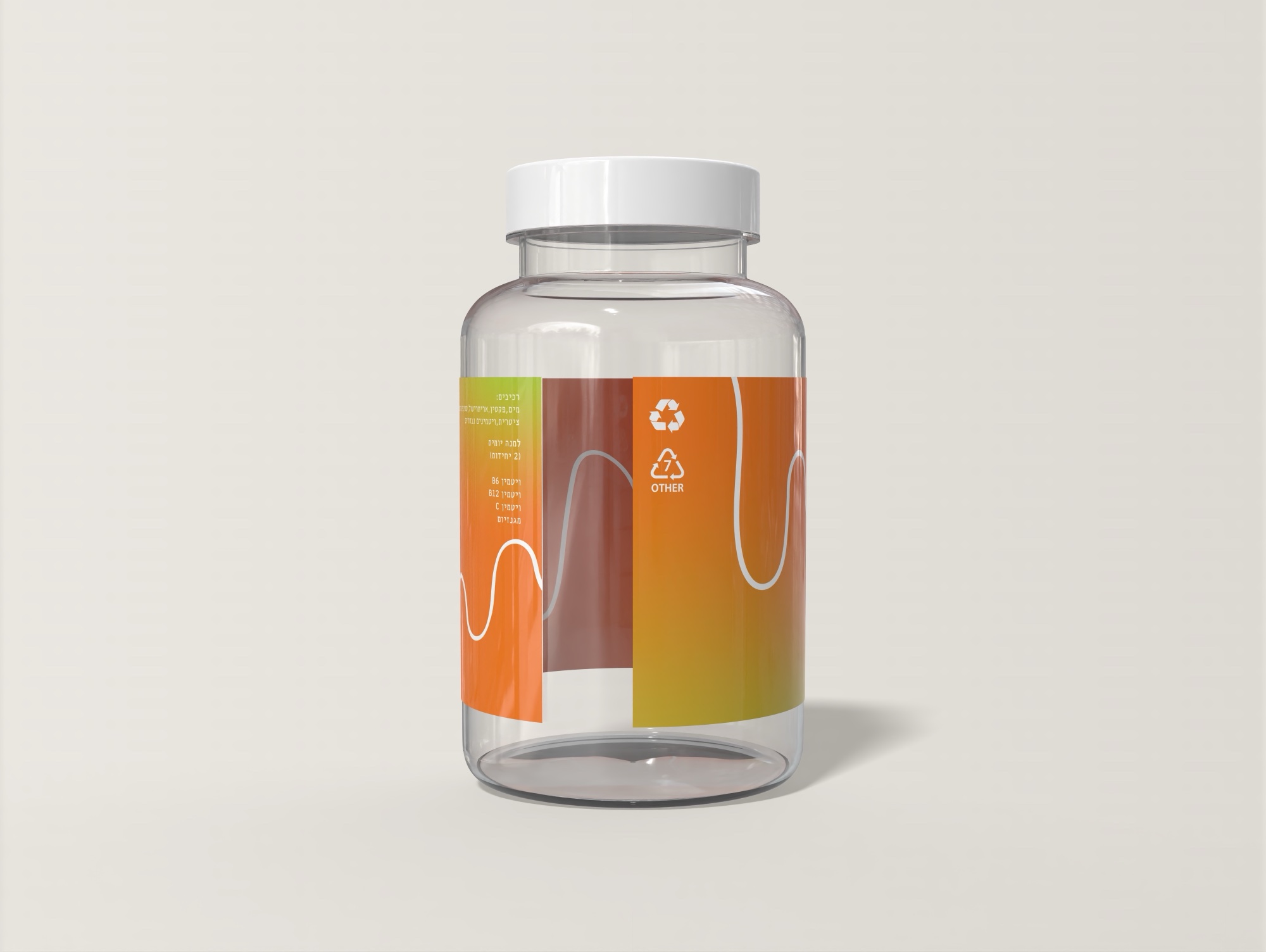
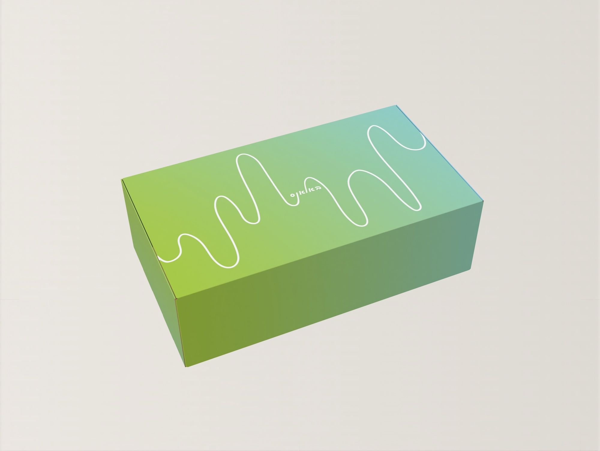
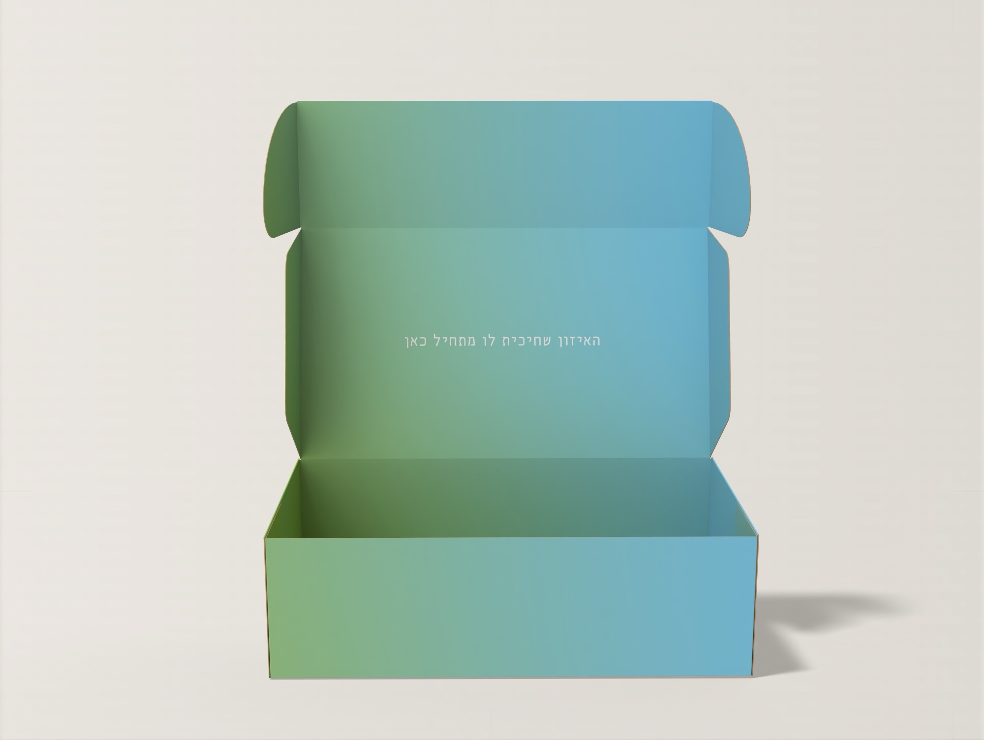
As part of the project, I designed a full brand system including packaging for shipping boxes, gummy supplements, and drink powder , creating a cohesive, soft, and youthful visual language.
01Logo
The wordmark stays the same. Only the wave changes — each product gets its own line, so the brand reads as one family with many rhythms.

02The range
03Powder drink bag
04Gummies jar
05Box
06Posters